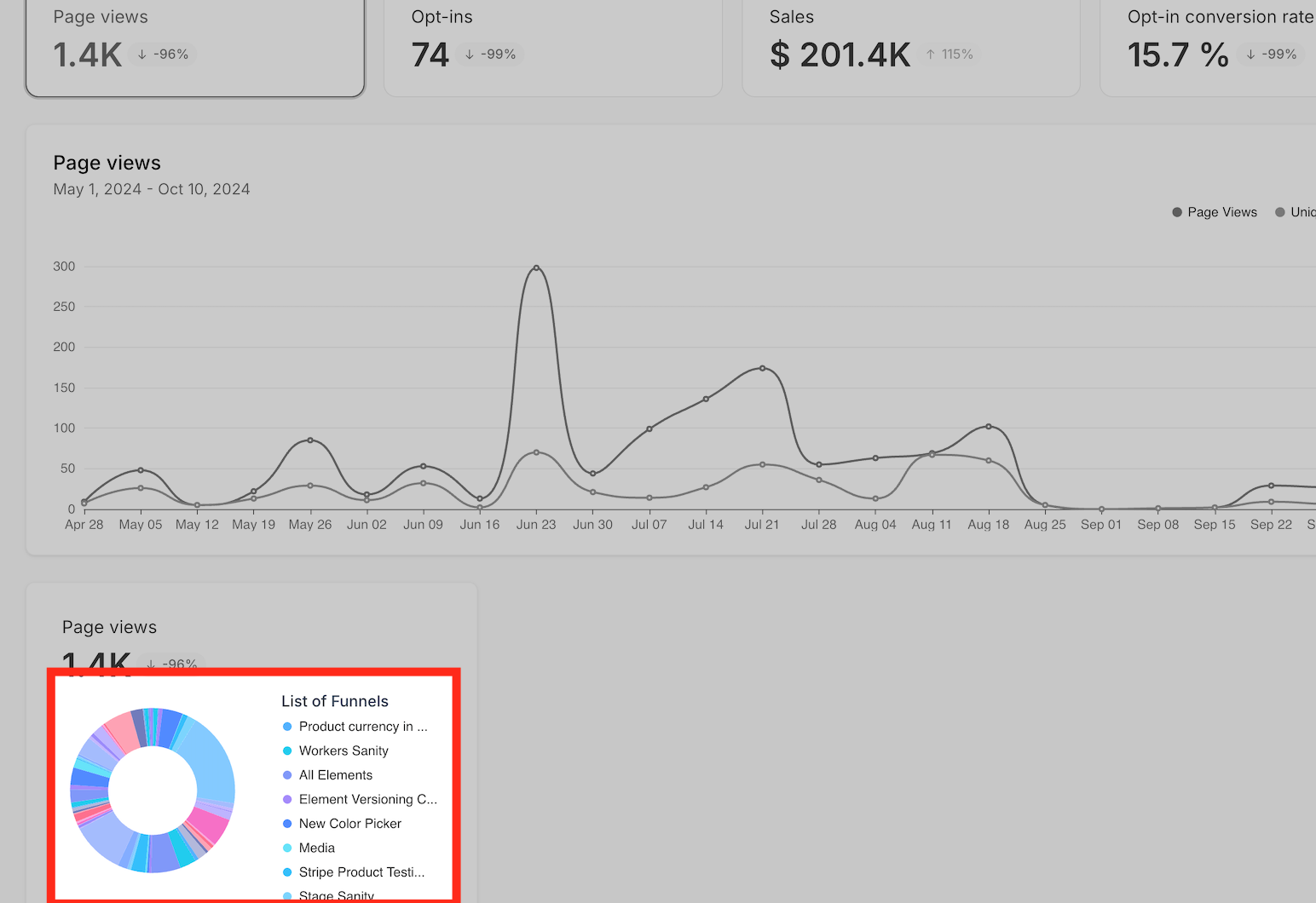
Now, you can see a visual breakdown of page views and sales with an interactive pie chart. The chart updates dynamically based on your selected filters—such as date range, specific funnels, or websites—ensuring you get the precise insights you’re looking for.
2. Page Views and Sales Breakdown:
This chart provides a clear visual of how page views and sales are distributed across various funnels or websites. It allows you to identify traffic patterns and pinpoint where sales are occurring, enabling you to refine and optimize these areas for higher conversions.
3. Funnel and Website Comparison:
This functionality enables you to evaluate the performance of multiple funnels or websites, highlighting which ones drive the highest page views and sales. By pinpointing top performers, you can focus your optimization efforts where they’ll yield the greatest results.
4. Step-Level Analysis:
You can also examine specific steps within a funnel or website, allowing you to pinpoint high-performing areas and detect opportunities for improvement, ultimately boosting overall efficiency.
How to Use the Pie Chart Visualization:
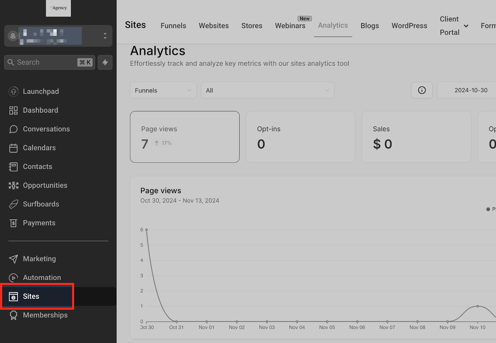
Navigate to Sites
In your sub-account view, go to the “Sites” section in the sidebar.
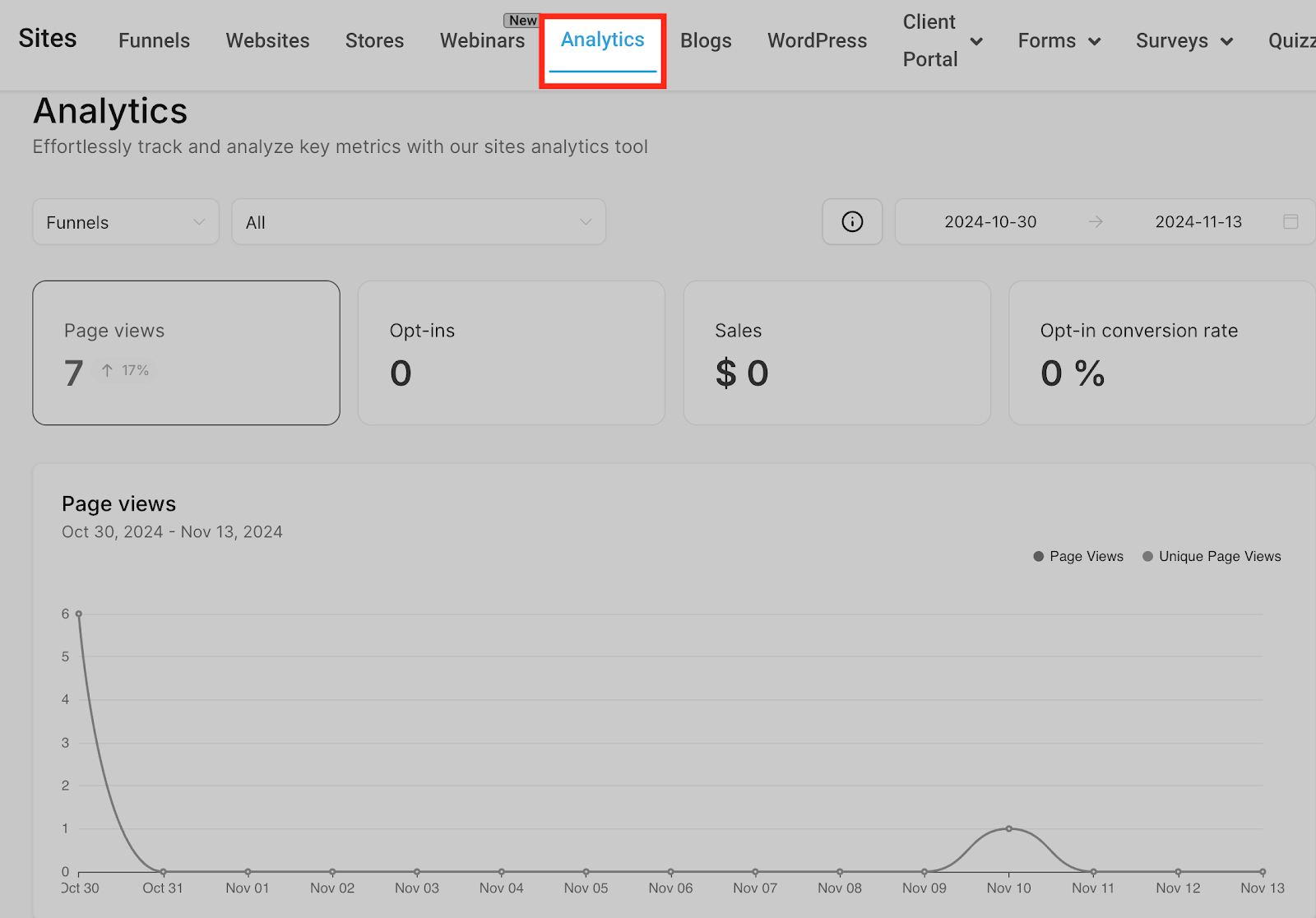
Go to the Analytics Tab
Once you’re in the Sites section, select the “Analytics” tab.
Locate the Pie Chart:
Look for the pie chart card under the line graph, found in both the Page-View and Sales sections.
Apply Filters for Custom Insights:
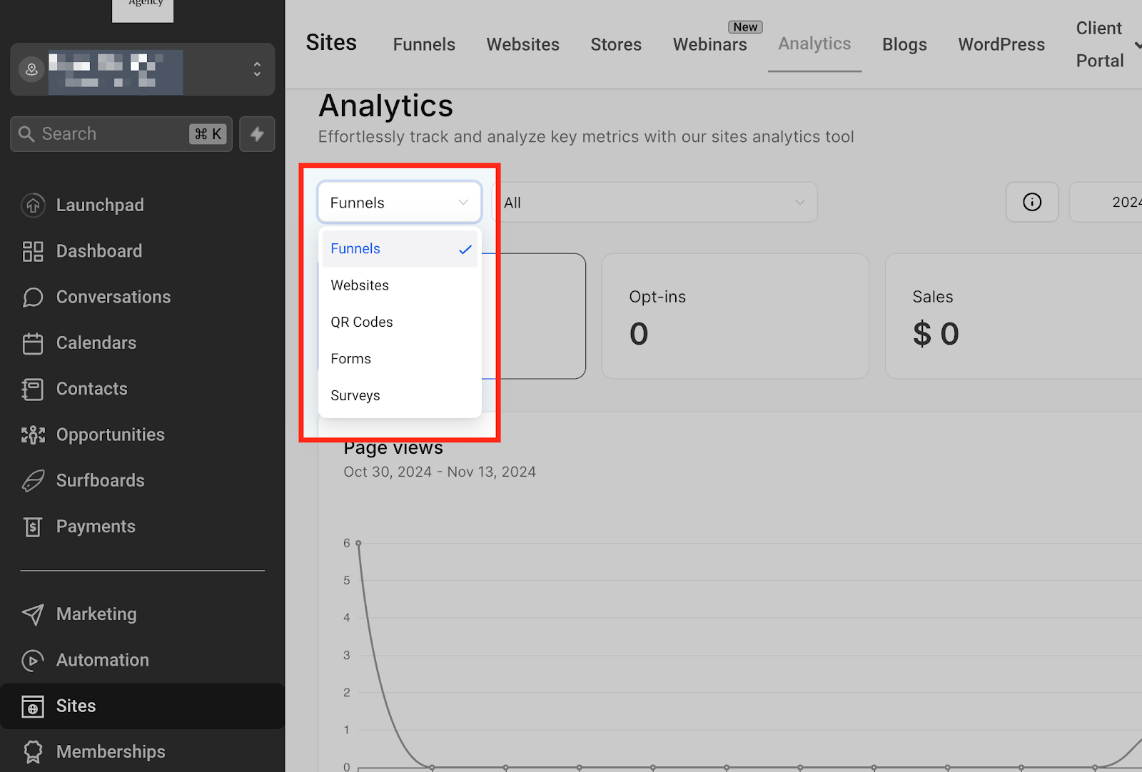
Type
Select “Funnel” or “Website” to customize what you’re viewing.
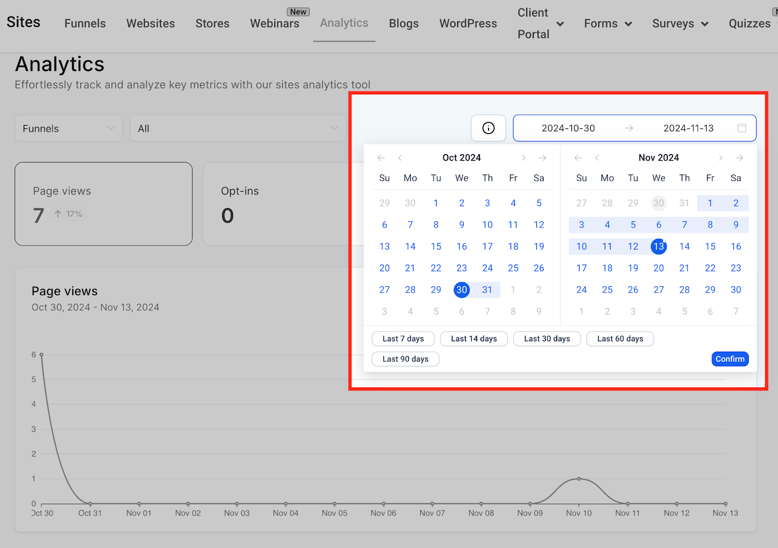
Date Range
Choose a specific date range to focus your analysis.
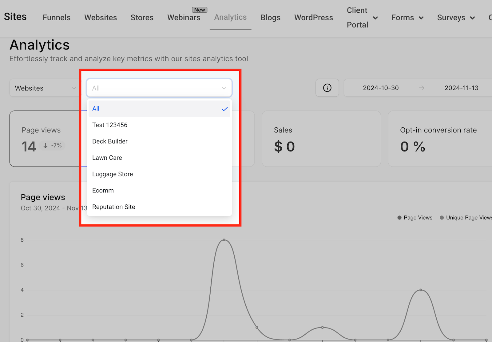
Individual Funnel or Website
Narrow down to specific funnels or websites for more detailed insights.